In this lesson, we will learn how to use the funnel drag & drop editor.
After clicking on the Edit Page button, you’ll be redirected to the funnel’s editor.
From this screen, you can edit and customize the current step of the funnel.
At the top of the editor, you will find a toolbar divided into two. The left side of the toolbar contains links related to different viewports, funnel’s settings, and the popup, while the right side of the toolbar will enable you to add different sections, rows, columns, and elements.
Desktop / Mobile View
By default, you are viewing the funnel in a desktop view.
In order to see what the funnel looks like on a mobile device, click on the mobile icon and the screen will adjust accordingly.
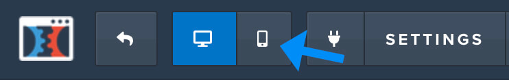
Note: make sure that the funnel is looking good on all devices. Many users are now using their smartphones as their preferred way to browse the internet.
Settings
Under the settings tab, you’ll find many options to change the design and the functionality of the funnel.
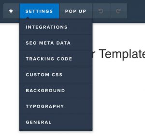
Integration
You can use the integration tab to integrate your funnel with 3rd-party apps.
For example, if you would like to integrate the form of this step with an app like Aweber, you can do so from inside the integration tab.
After integrating between the two, all the signed up subscribers that will use the form, will automatically be transferred to the Aweber app.
Of course, you can integrate Clickfunnels with many different kinds of apps.
SEO Meta Data
Using the SEO Meta Data you can control how your funnel is going to look on search results and social media channels.
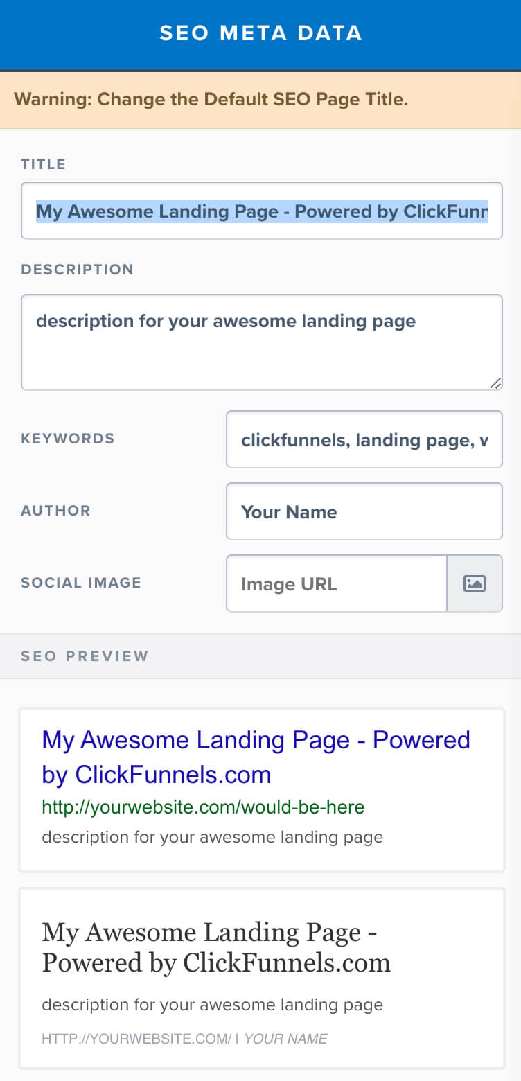
The top part of the metadata box will enable you to change the title, description, keywords, author, and social image, while the bottom part of the box will auto-generate an SEO preview as you making changes.
If for example, we are looking for ‘dumbbell’ on Google, the blue text is the title and the text below it is the description.
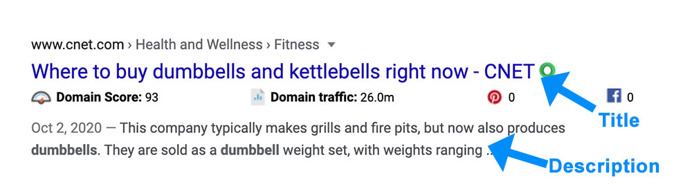
You can use the SEO Meta Databox to control the title and the description text that appears on Google when someone is searching for your funnel.
Please note: failing to enter a custom text will result in Google choosing a random text from your funnel.
Make sure to enter relevant keywords inside the keywords field that related to your funnel. It will increase the chance to get ranked in a higher position.
You can use the social image option to upload an image that will be displayed on social media channels when visitors sharing the funnel. If you won’t choose a designated photo, the image that will get shared will be just a random image from the funnel.
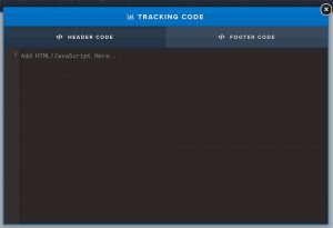
Tracking code
You can use the tracking code option to paste Google Analytics or Facebook pixel codes inside the funnel’s header or footer to track different data such as bounce rate and conversion.
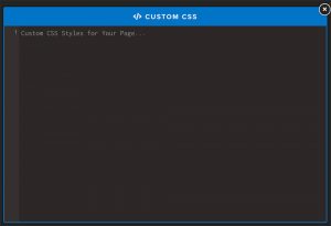
Custom CSS
Use the custom CSS option to enter your own custom CSS rules to design your funnel.
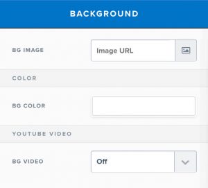
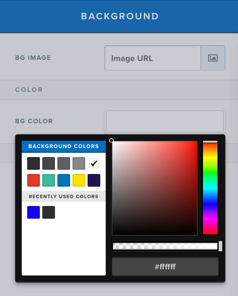
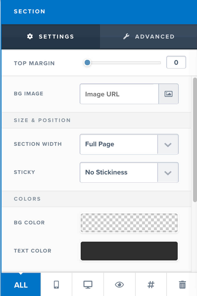
Background
You can change the background of each section from inside each section editor sidebar.
However, if you would like to change the background color of the funnel’s body to an image, gradient color, or a solid color, you’ll need to do it from inside the background tab.
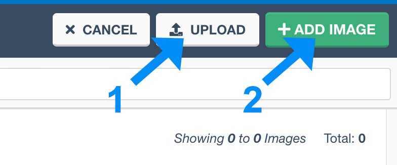
To set a background image or gradient color, click on the image icon.
To choose an image, upload your desired image and click on Add Image.
To set a gradient color, navigate to the Background tab, choose your desired pattern, and click on Add Image.
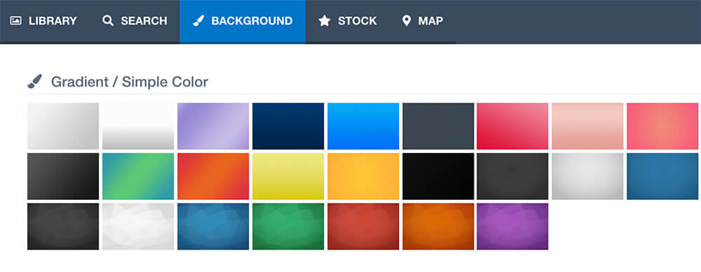
To stick with a regular solid color, choose your desired color from the menu on the right.
Typography
You can change the font of each of the elements from inside the widget editor sidebar.
However, if you would like to assign a global font for the funnel as a whole, you can save valuable time by setting it up from inside the typography tab.
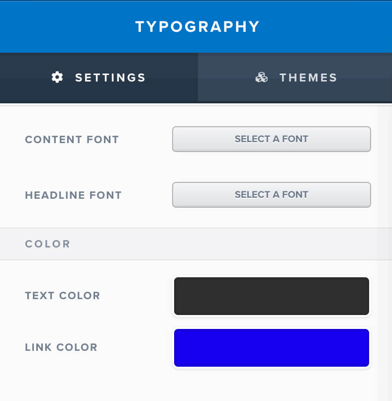
You can set a specific font for the content text and a different font to the headline text.
In addition, you can set global colors to the content and the links of the funnel.
By default, the link color is blue, if you would like to change to color to any other color, just choose a different color inside the link color option.
General settings
In the general tab, you’ll find all the options that didn’t fit in any other tab.
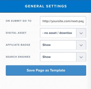
From inside the general tab, you can redirect your funnel to a different website after submitting the form.
The digital asset option will enable you to assign a digital product to this step of the funnel that will be sent to the subscriber’s email address upon submitting the form.
For example, if you promised a PDF book upon subscribing, simply choose the PDF file that you would like to send automatically after subscribing.
The affiliate badge will show or hide the ‘made with Clickfunnels’ badge at the bottom right corner of the funnel.
The search engine option will let you decide whether to show or hide your funnel in search results.
The Save Page as Template button will let you save your design as a template if you would like to use the same design for future projects.
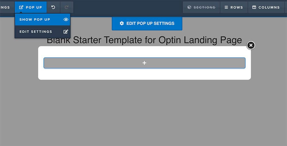
Clickfunnels Pop Up
Every funnel page has a popup.
The option is yours if you would like to display or trigger it.
The popup tab has two options: display pop up, and edit settings.
Display pop up
The display pop up option will simply display the pop up of this step.
Some of the templates come pre-loaded with pre-made pop-ups while others are not and you’ll need to design it yourself.
Building the popup framework is very easy and we will learn how to use sections, columns, and elements down below.
Pop up settings
The pop-up setting screen will enable you to customize the look and functionality of the pop up.
You can change the top margin, background image, width, padding, and different colors of the modal.
A cool feature to familiarize yourself with is trigger on exit.
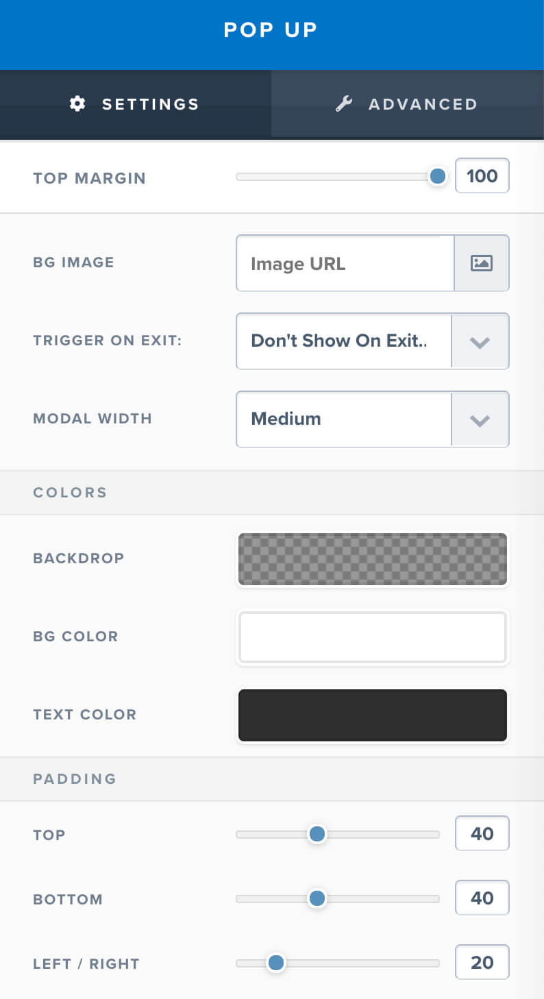
By enabling this option, the pop up will appear on the screen whenever the visitor will navigate his mouse toward exiting or leaving your funnel.
That way, the pop-up will draw the user’s attention back again and improve the signup rate.
You can see a good example of an exit popup at the pluginsforwp website.
Building The Funnel
After we finished with the left side of the toolbar, we can move to the right side of the toolbar, and inspect the sections, rows, columns, and elements.

The links are organized from left to right in the right hierarchy.
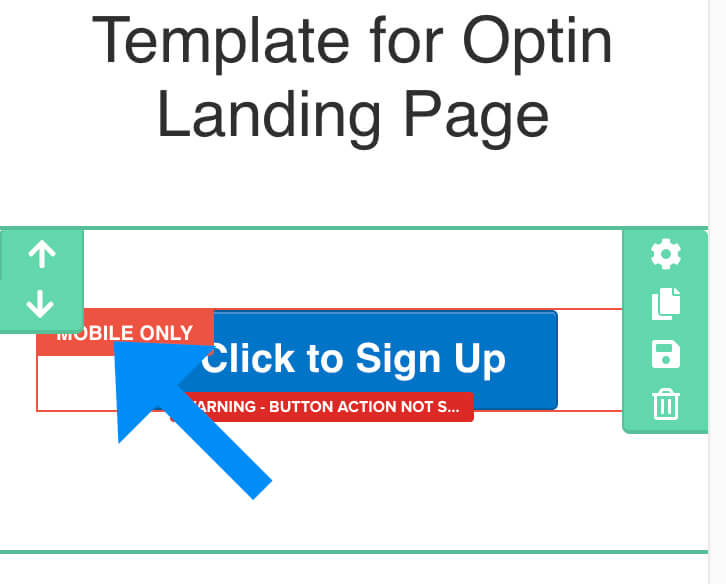
Sections are marked with a green frame and are the outer part.
Rows have a blue frame and are living inside the sections.
Elements (or widgets) are the individual components inside the rows and are marked with an orange frame.
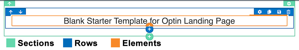
To add a new section, row, or element, simply click on the desired button from the toolbar or on the colored plus icon of the component that you would like to add. (green for sections, blue for rows, orange for elements).
Adding a section
After clicking on the green plus icon to add a section, you’ll have few width options to choose from.
After adding your desired width, the new section will be added to your page.
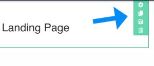
When hovering your mouse on the section, you’ll have the option to add a new row, enter the settings screen of the section, clone, save, or delete it.
Add a new row
To add a new row inside the section, click on the Add New Row button, and choose the number of columns to include in the row.
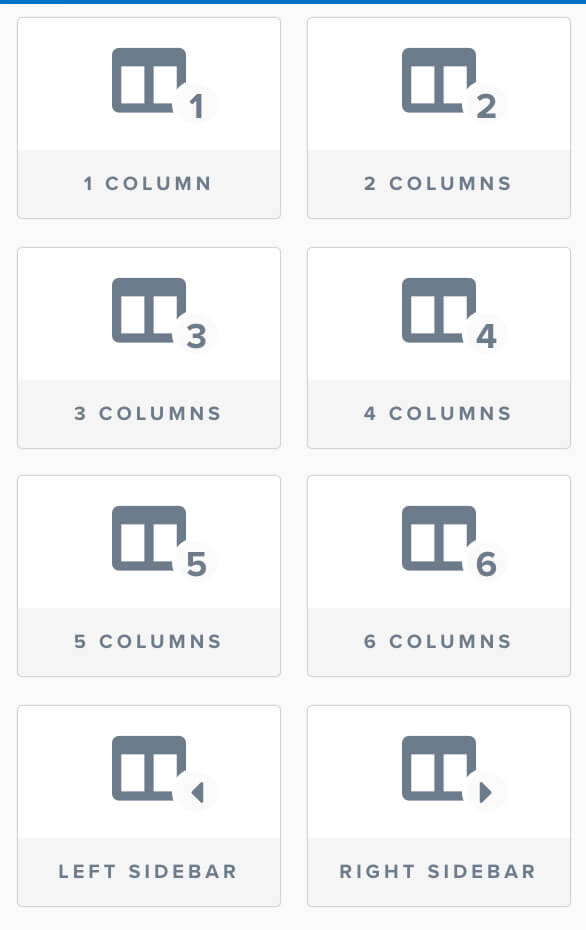
After choosing your desired structure, the new row with the columns will be added inside the section.
Just like with the section above, you will be able to enter the settings screen, clone, save or delete the row.
After choosing your row and columns, you can start adding the elements inside the columns.
Add elements
Elements are going inside the columns.
To add a new element, click on the Add New Element button inside the column.
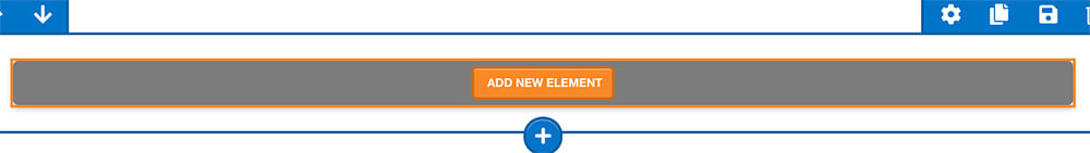
After clicking on the Add New Element button, the widgets sidebar will open up on the right with different elements to choose from.
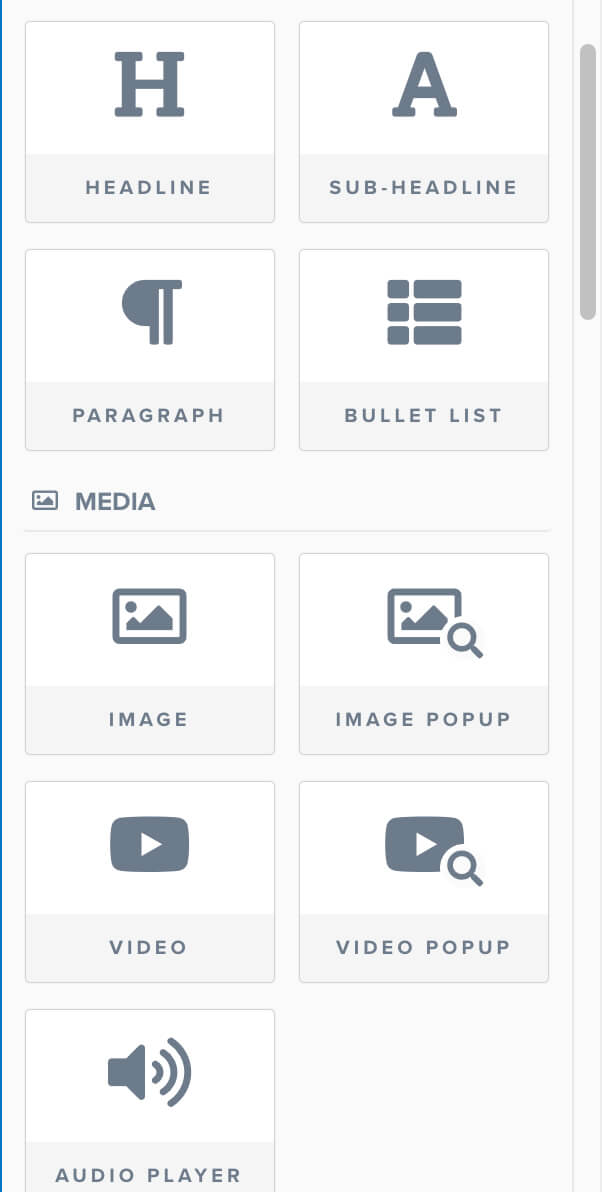
Browse between the many different elements and choose the one that you would like to add by clicking on it.
After clicking on your desired element, it will be added inside the column.
Editing the components
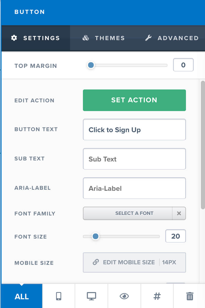
When opening the settings screen to edit a section, row, or element, the settings sidebar will open up on the right with different options related to the component you are editing.
For example, when opening the settings sidebar of a section, you’ll have editing options related to the section itself such as changing the width, background colors, padding and etc.
On the other hand, when editing a widget like a button, you’ll have different options that related to the button itself like the button text, action, colors and etc.
At the bottom of every settings sidebar you’ll find six icons: All, mobile view, desktop view, hide, get CSS info, and delete.
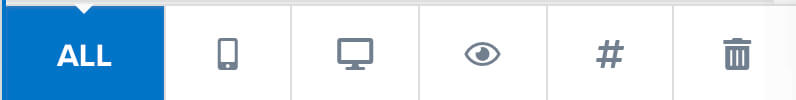
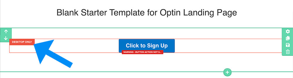
All means that the component is displayed on all screen sizes, desktops, and mobiles.
Mobile view meaning that you only want to display the component on mobile devices and hide them on desktops.
When choosing the mobile view only option, a new tag will be added to the component reminding you that the element is only presentable on mobile devices.
When choosing the desktop view only option, a new tag will be added to the component reminding you that the element is only presentable on desktops.
The hide icon will hide the component on all screens.
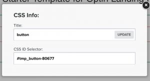
The get CSS info will provide you with the CSS class of the element. It is very useful if you would like to enter your own custom CSS.
The delete icon will delete the component.
Now that you know how to add and edit sections and elements, it is a good time for you to get your feet wet and start designing the funnel.
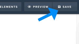
When you satisfied with the results, click on the Save button on the top right corner to save your progress and publish the funnel.
Frequently asked questions
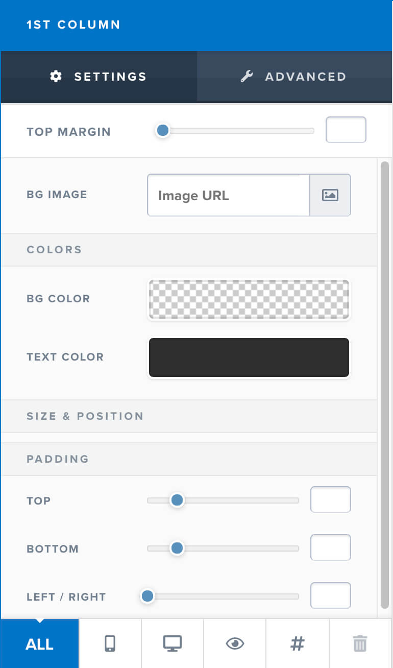
How to access columns?
To access individual columns inside a row, click on the Columns tab at the top toolbar.
The manage columns sidebar will open up with all the different columns.
To access the settings screen of one of the columns, just click on the settings icon to the right of your desired column.
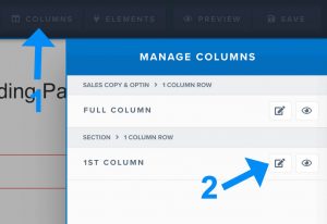
The settings screen of the column will open on the right where you can change the settings that related to the specific column like background colors, borders, and etc.
How to trigger the pop up?
In order to display and trigger the pop up, we will need to hook it up to a button.
Add a button element to any of the columns and change the Set Action on the right side to Open Pop Up.
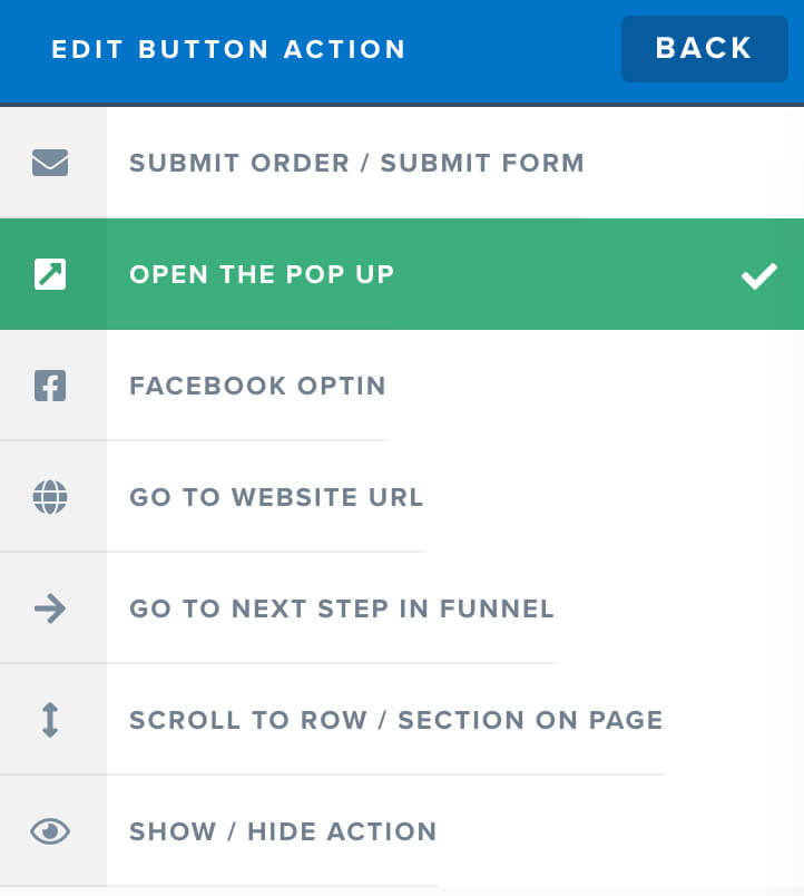
Now, when clicking on the button, the pop up will be displayed.
Conclusion
In this lesson, we walked through and learned how to use the Clickfunnels editor.
We learned what are the different options of the top toolbar and also how to design your funnel with sections, rows, columns, and elements.
If you have any other questions to add to the FAQ section, please ask using the comments form below and I will add it.
In the next lesson, we will learn how to integrate Clickfunnels with different apps.